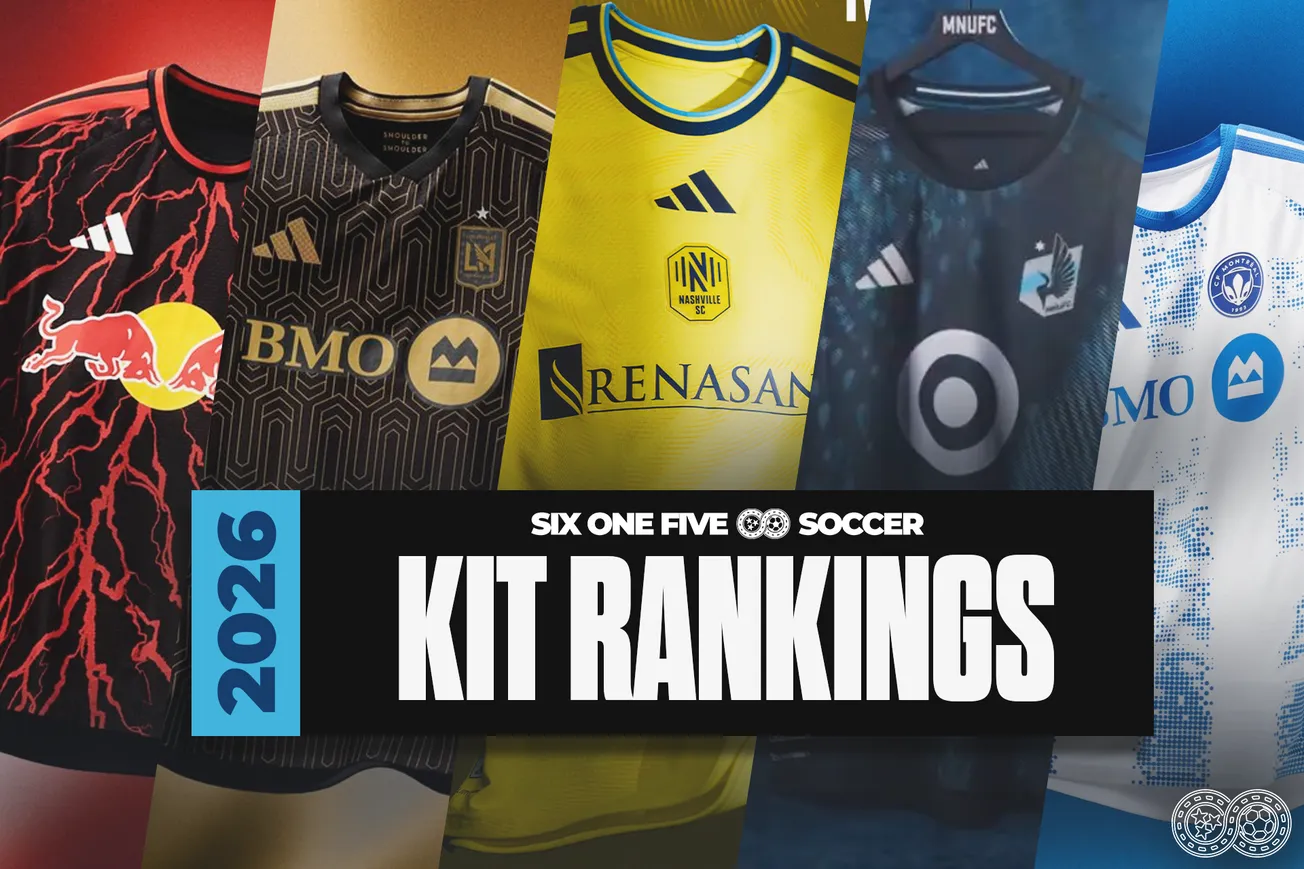
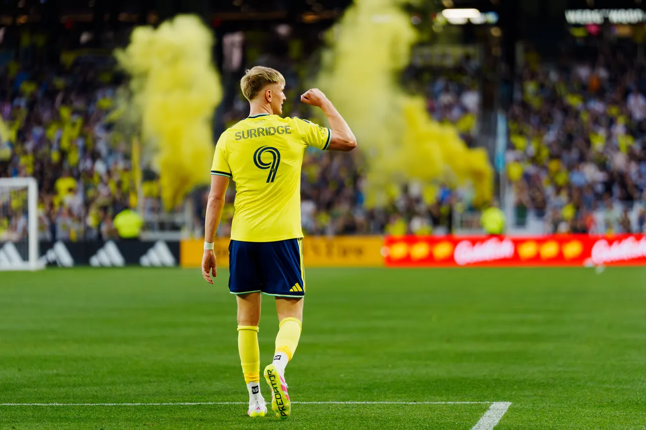
The 2026 MLS regular season is just over a week away. Yeah, I did a double-take writing that. In 11 days, all 30 MLS clubs will take the field to ring in the new season, a desperate attempt to knock Inter Miami off their perch.
Those whispers of a sound you're hearing on the wind? Those are the sounds of the last balls being kicked in preseason, the last pens signing names on the dotted lines of last-minute contracts, and CSOs scrambling their owners' private jets for one last foray into Argentina for the game-changing midfielder that will tie it all together.
Today, though, you're hearing the sounds of 1,000s of fans (or hundreds, depending on your market) either screaming with joy or wailing with despair upon the release of their new kits for the season. 30 kits of varying levels of originality hit the shelves today, locking fans into a look for the next 12-18 months.
Here at SixOneFive Soccer, we're breaking down all 30 kits and ranking them from worst to first.
These rankings are purely objective, with every trace of human bias removed. This list is backed by the full power and might of Science™ and is solely based on my (Ben Wright's) opinion. Disagree all you want, but resign yourself to the knowledge that ultimately, you are wrong.
Let's gain this grain.
30 – St. Louis City "Tina Turner Kit"
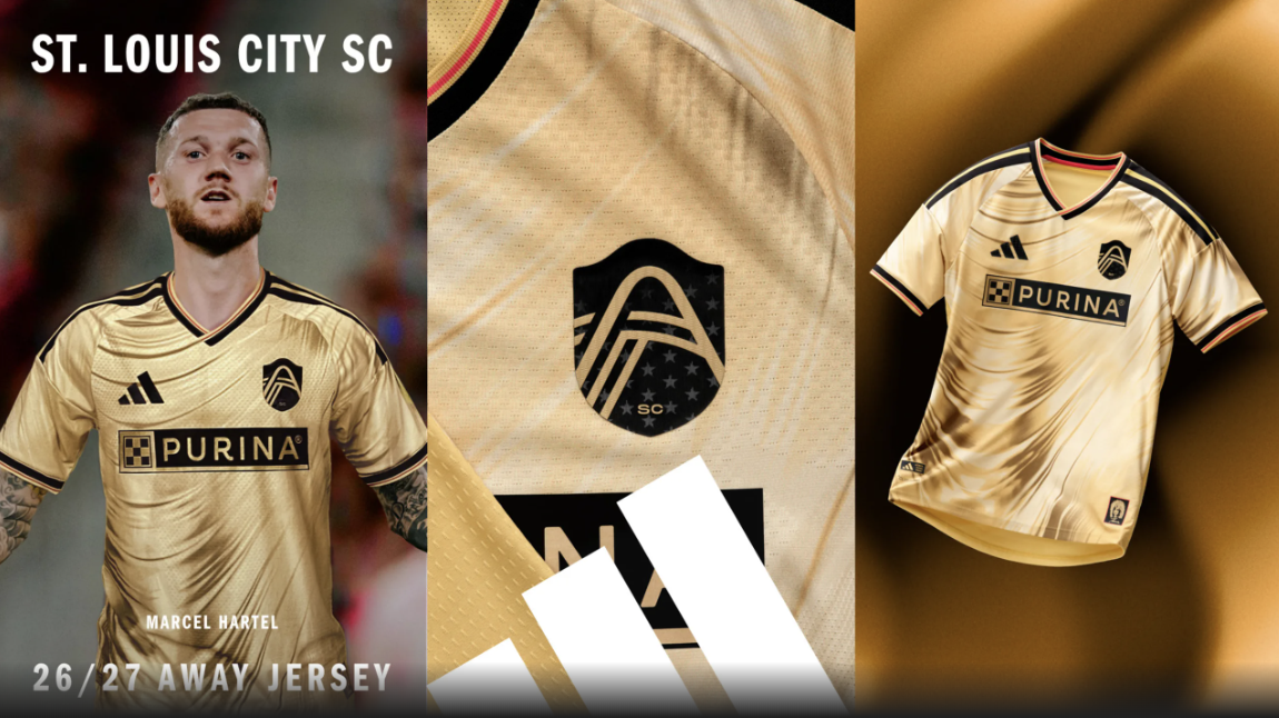
I respect the out-of-the-box idea and collaboration with a local icon here, and I will always applaud teams taking swings. St. Louis swung hard with their Tina Turner collab, but it's unfortunately a miss in my book.
Introducing The Tina Turner Kit 🎤 A tribute to the Queen of Rock ‘n’ Roll and her unstoppable energy. A celebration of her enduring spirit and the city where she found her voice.
— St Louis CITY SC (@stlcitysc.com) 2026-02-10T22:49:36.374Z
The color here is just... it doesn't work. It looks less Tina Turner-inspired and more badly stained. It's rough.
This is unfortunately my 5-year-old daughter's favorite. We will have a talk later.
29 – Houston Dynamo "Mission Control Jersey"
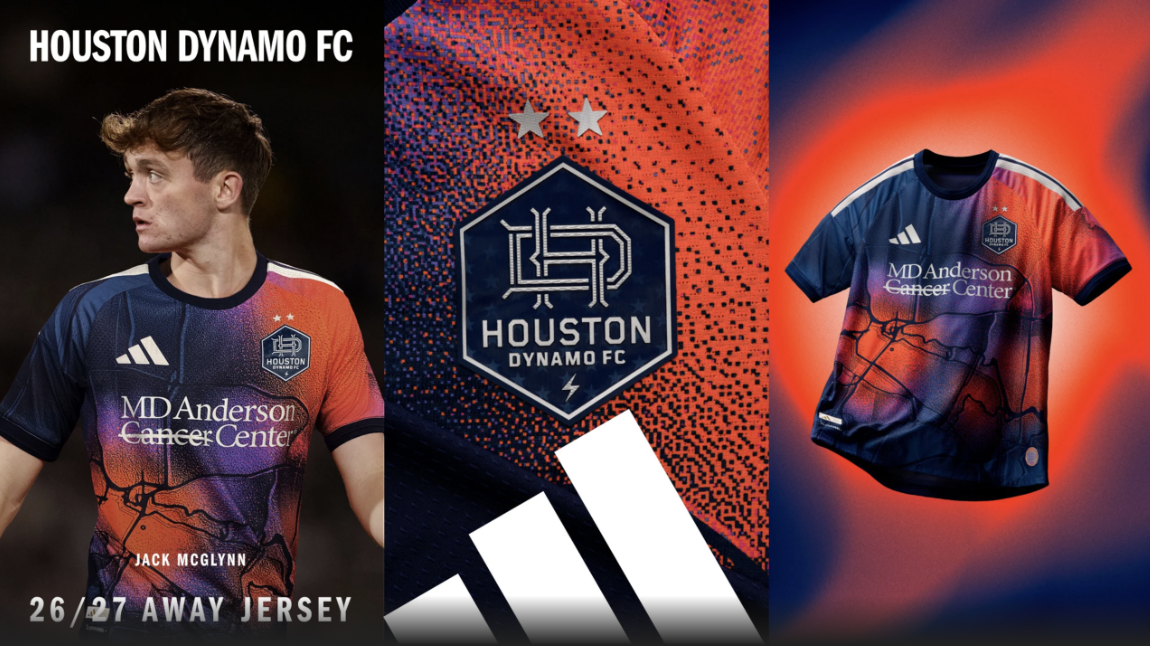
This is a mess. I respect taking a shot here, and the concept of an aerial map of Houston is cool, but the result is something that looks like Spyro the Dragon splattered into a wall during an unfortunate flying accident.
Born from the H, made for the H.
— Houston Dynamo FC (@HoustonDynamo) February 11, 2026
Introducing the Mission Control Kits 🛰️ pic.twitter.com/2SOOfJ6hh5
Unlike others on this list, I'm not sure there will be many redeeming qualities on the pitch.
This is my 2-year-old son's favorite, but he also thinks Rubble is the best Paw Patrol character, so take his opinion with a grain of salt.
28 – Red Bull New York "Rooted Kit"
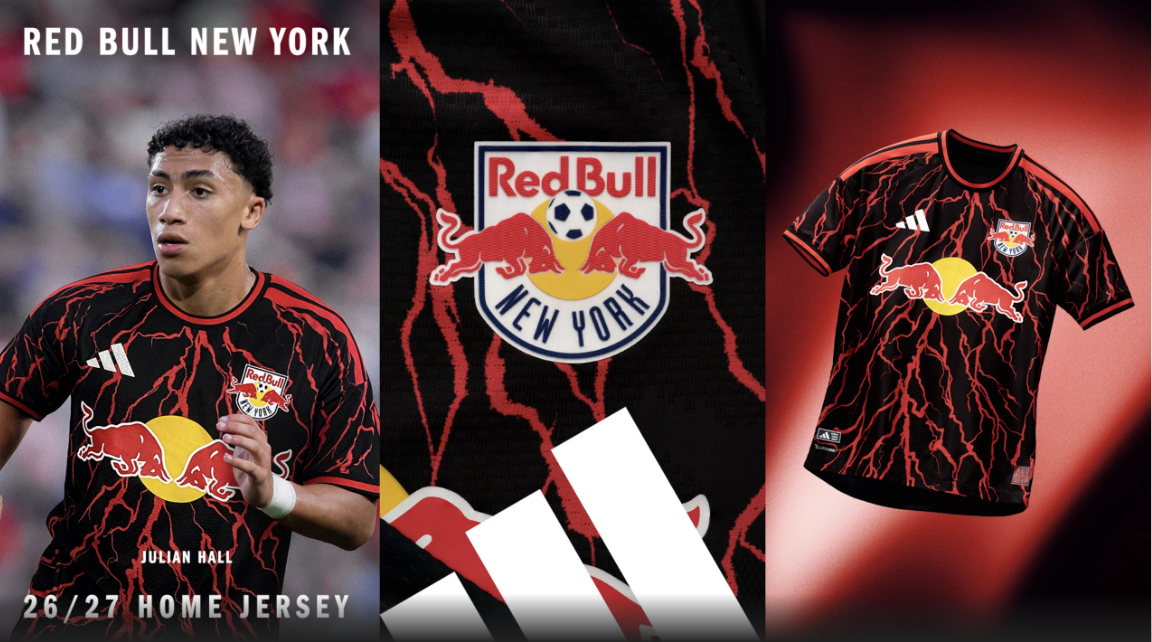
Some people will absolutely love this. I'm not one of those people.
Putting down Roots. Serving up looks. #RBNY | @OANDA pic.twitter.com/xDTyGBZEC2
— Red Bull New York (@NewYorkRedBulls) February 10, 2026
It's really, really busy, and I don't love the departure from the classic red-and-white color scheme they used at home during their heyday. Am I turning into a boomer?
27 – DC United "Black-and-Red Kit"
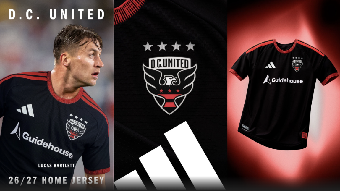
The aptly named "Black-and-Red Kit" is a black and red kit that doesn't do anything special but is at least respectable. That's something for all of DC United to aspire to this year.
26 – Colorado Rapids "The Colorful Colorado Kit"
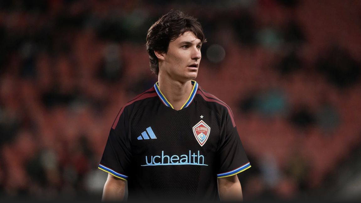
I really, really like this shirt. The band of color on the collar and cuffs are fantastic, and I love how much it leans into the light blue on the sponsor logos.
I also really don't love it as Colorado's primary kit. They have one of the more unique color schemes in MLS and a very recognizable home look. Veering away from it, especially when explicitly trying to celebrate the history of the club, is a choice.
25 – Toronto FC "The Winter Kit"
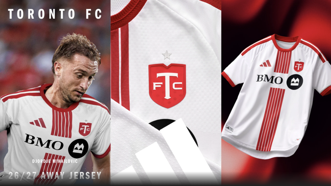
It's fine.
24 – Real Salt Lake "Switchback Kit"
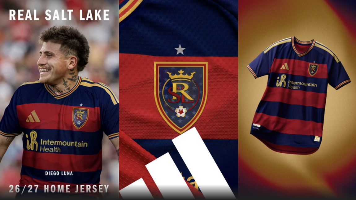
I'm a sucker for horizontal stripes, so I like a lot of this. The sublimated Wasatch Mountain Range design was a cool idea in theory, but in practice it looks like sweat stains.
23 – Chicago Fire "Forever Red Jersey"
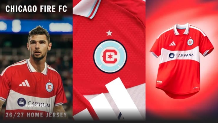
The collar is a win. The shape of the stripe across the front feels really weird to me, though. I really want to like this and can't quite pinpoint why I don't.
22 – Nashville SC "Reverb Kit"
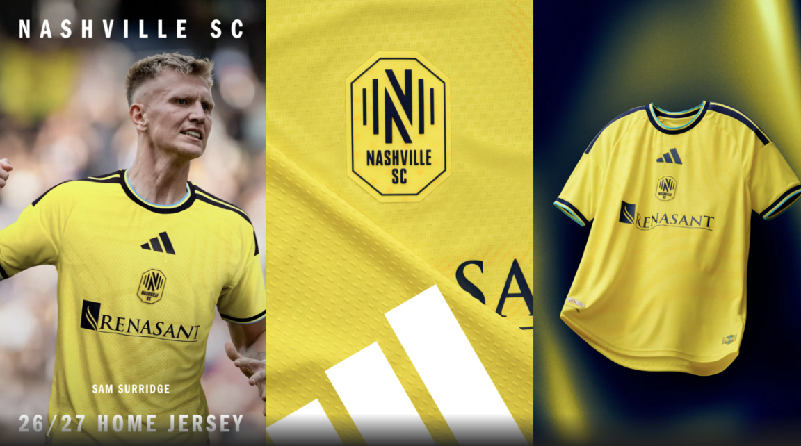
I like most of this shirt, and (as always) the actual release is significantly better than the leaks. Incorporating the sky blue for the first time is a win, and I love the "reverb" pattern on the front. It looks great in person.
I don't like centered crests as a rule, and especially with this, where the Adidas logo dwarfs the Nashville crest. Without the centering, this would have been maybe their best primary kit to date, an 8/10. As is, it's fine.
21 – Seattle Sounders "Evergreen State Kit"
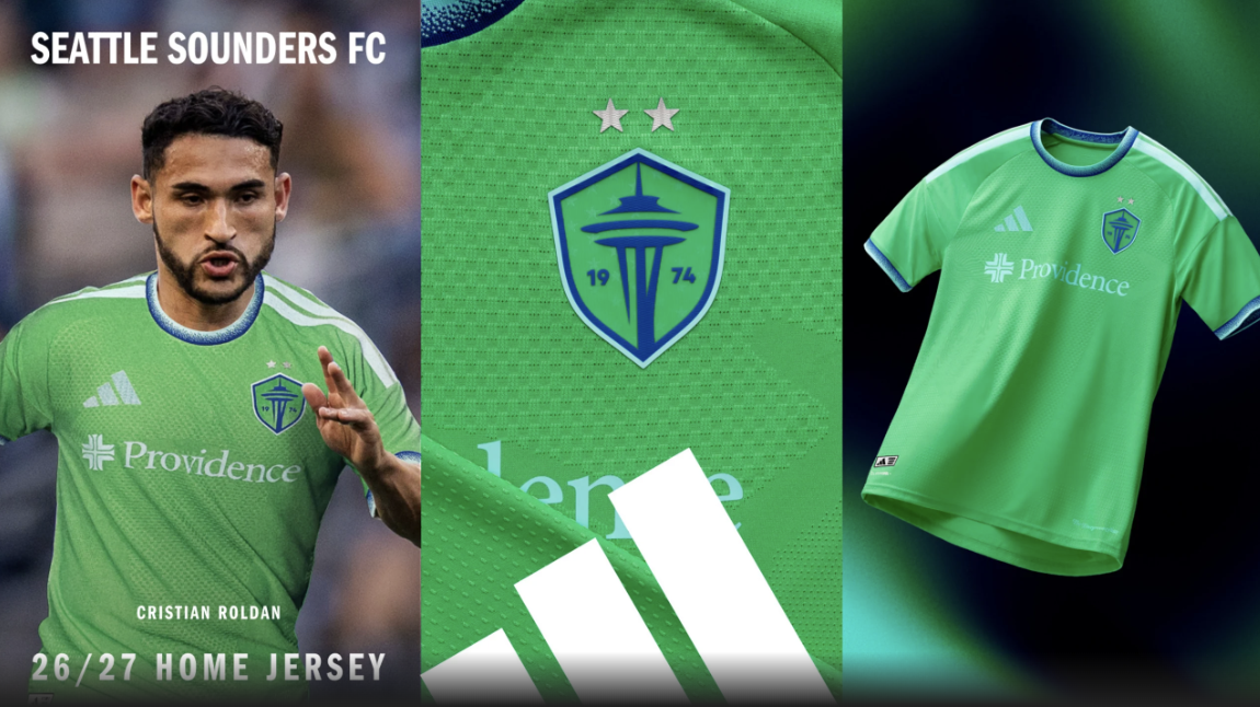
Like others on this list, this is a perfectly fine if unspectacular kit. It won't look bad in any scenario, and it will age well. It's not especially remarkable, which is fine. The fairly generic design is saved by one of the best color schemes in MLS.
They're following up one of the best shirts in MLS history, though. I know it sets the bar high, but I would have liked to see more. It feels slightly sacreligious to put a Seattle kit this low.
20 – New England Revolution "Independence Day Jersey"
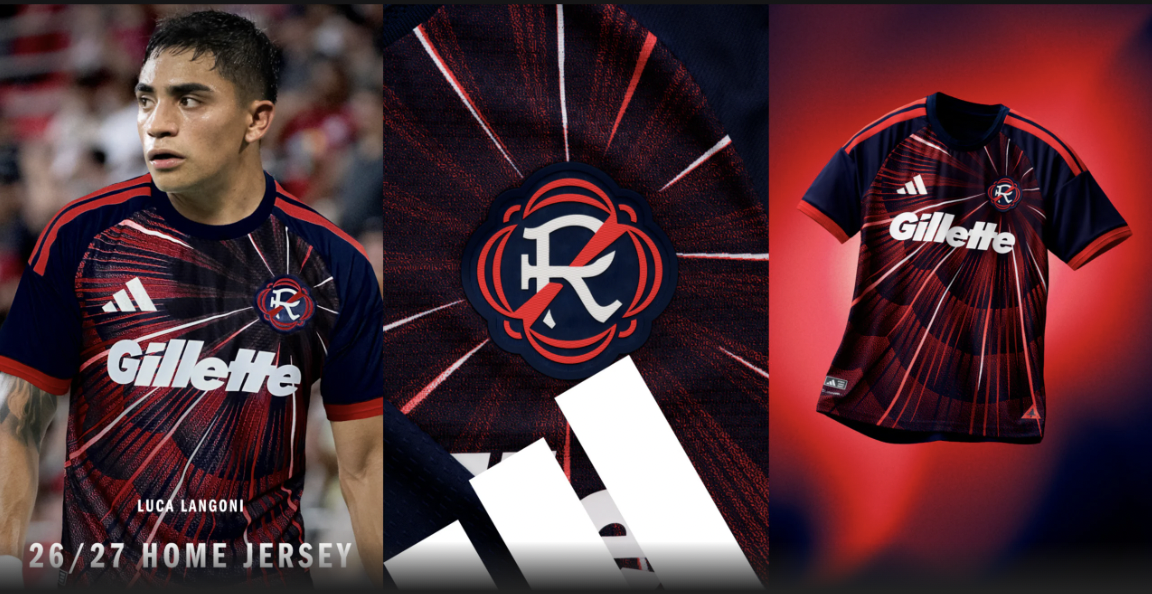
I can't decide if the pattern radiating from behind the crest is cool or tacky. I lean more towards cool, but I also don't think it'll look especially distinctive on the field. It's solid, though.
19 – LA Galaxy "VeloCITY Kit"
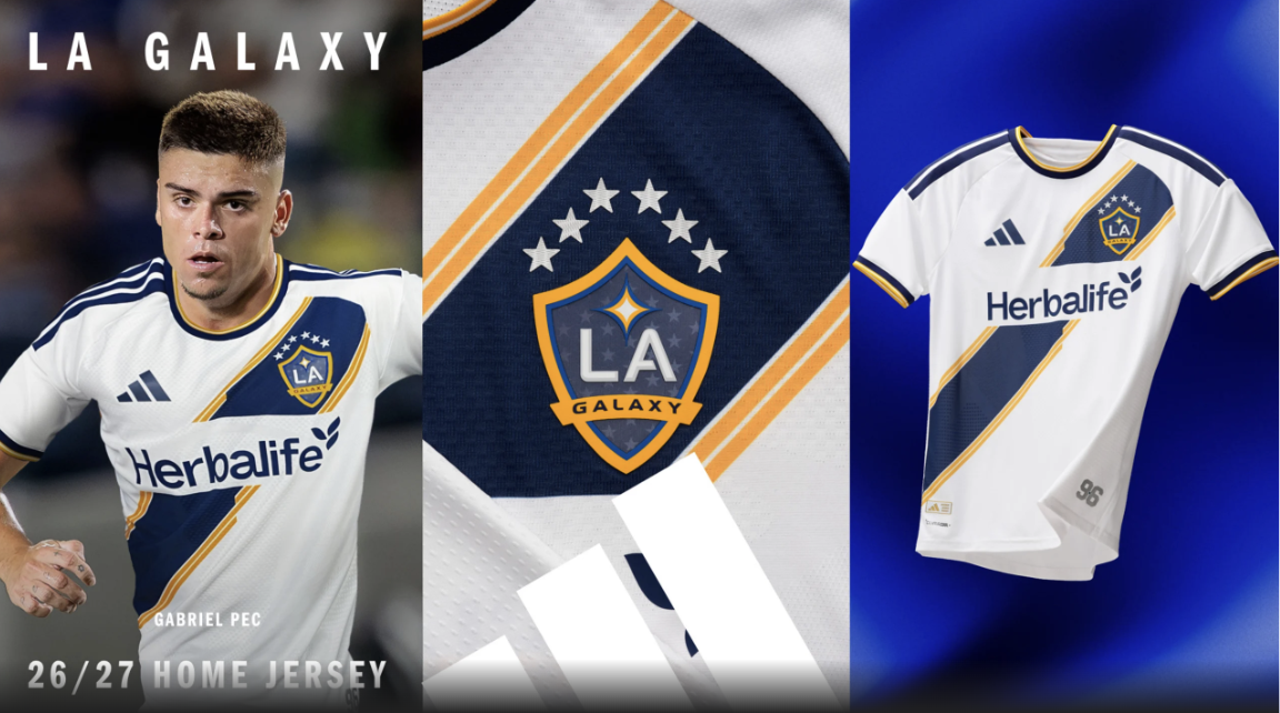
This isn't my favorite sash kit that the Galaxy have put out, but I love that they're leaning into this as their identity. The spacing feels really off, though. The Herbalife logo feels like it's too low, and the six stars on the crest make it sit off-center — what a problem to have, right?
I like a lot about this, but it's not the greatest execution.
18 – Orlando City "Sunken Treasure Kit"
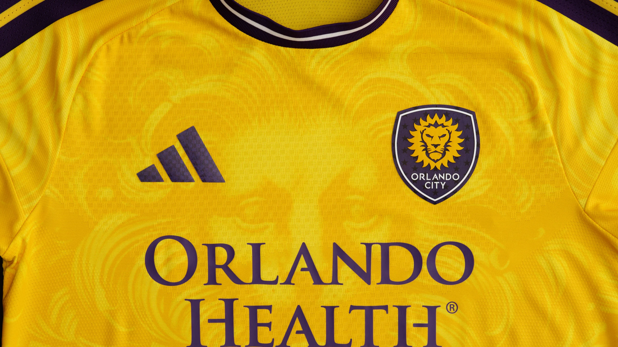
I take everything back about not being able to make a solid yellow shirt cool. This is hella cool.
Is it good, though? I'm less sure about that. The eyes feel like they're staring into my soul, and that makes me uncomfortable.
17 – Portland Timbers "Civic Stadium Kit"
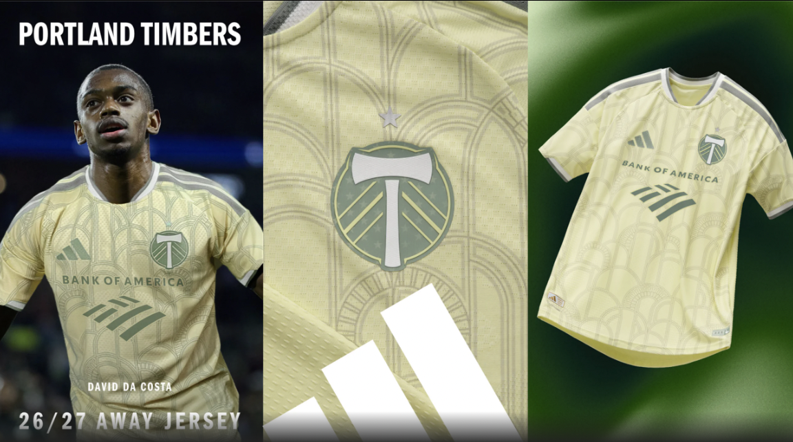
The Timbers always take risks with their kits, and sometimes they pay off more than others.
Carved from history 🏛️
— Portland Timbers (@timbers.com) 2026-02-10T21:13:18.360Z
It's a cool concept and certainly fits the "uniquely Portland" bill, but I don't think it looks particularly good, and that's a problem. This shade rarely looks great on the pitch.
16 – Inter Miami "Presagio Kit"
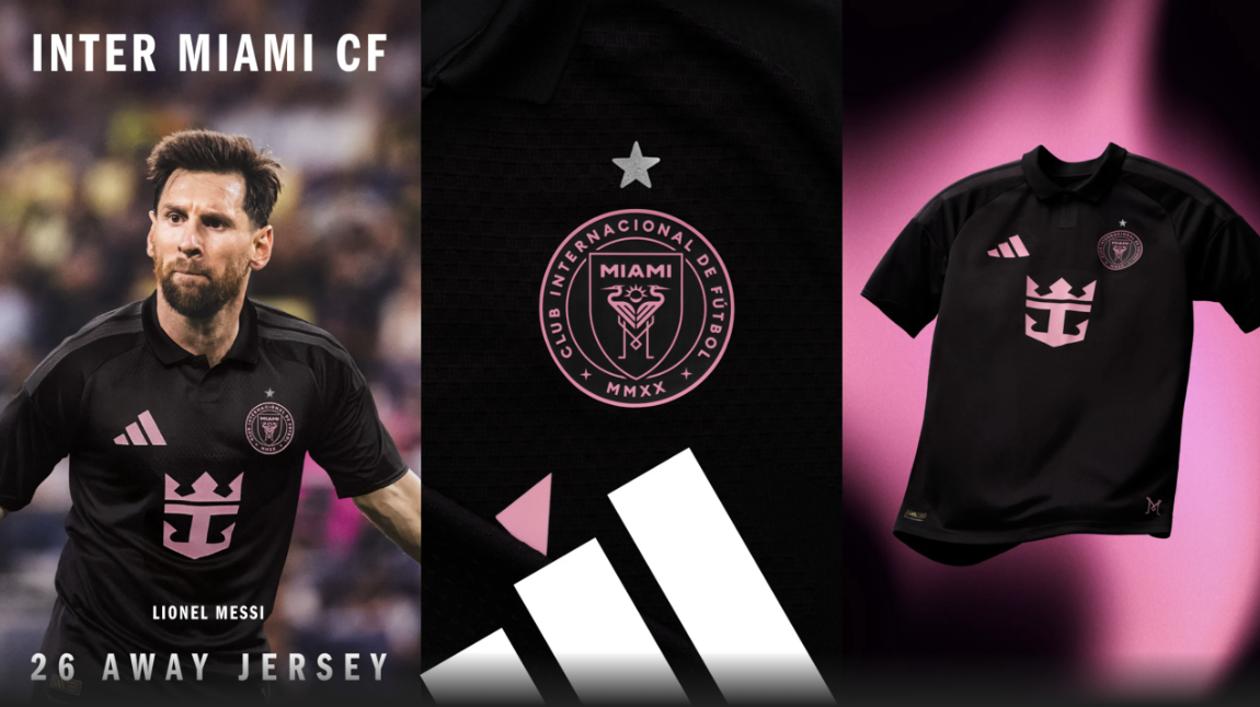
Totally fine. They'll win unreal amounts of games in this, adding to what will already probably be the best-selling jersey this year for obvious reasons. As an unrepentant evangelist of the pro-collar agenda, I'm somewhat obligated to like this. It's not particularly bold, but it works.
15 – Columbus Crew "Crafted for Excellence Kit"
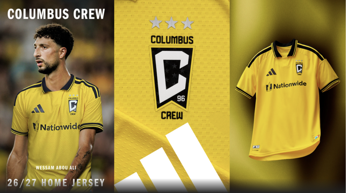
Like I said with Nashville, it's hard to make a solid yellow shirt that special. I like that the Crew kept it simple, though, and the collar is a huge win.
This isn't a flashy kit, but it knows what it's trying to be and does it without much fuss.
14 – Vancouver Whitecaps "The Costal Jersey"
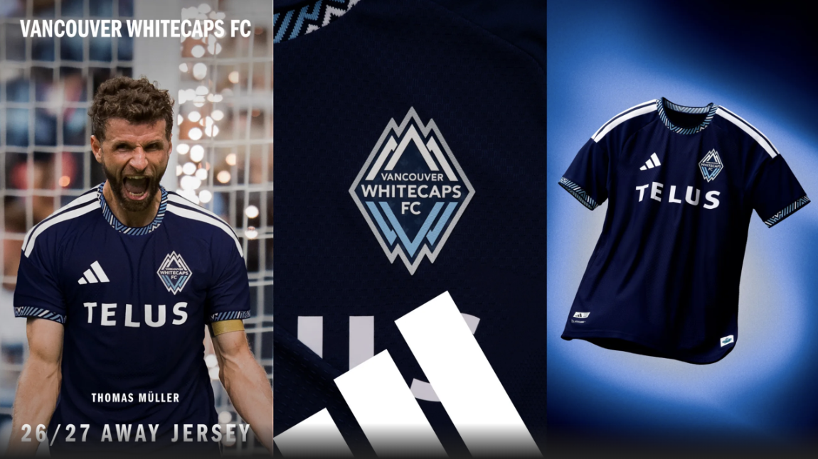
The day the Vancouver Whitecaps put out a bad shirt will be the day that the national media give them the attention they deserve. So, probably never.
Another banger from a design team that just doesn't seem to miss. The details on the collar and cuffs are fantastic. This will look just as good in 20 years as it does now.
13 – Charlotte FC "Carolina Kit: Crowns Up"
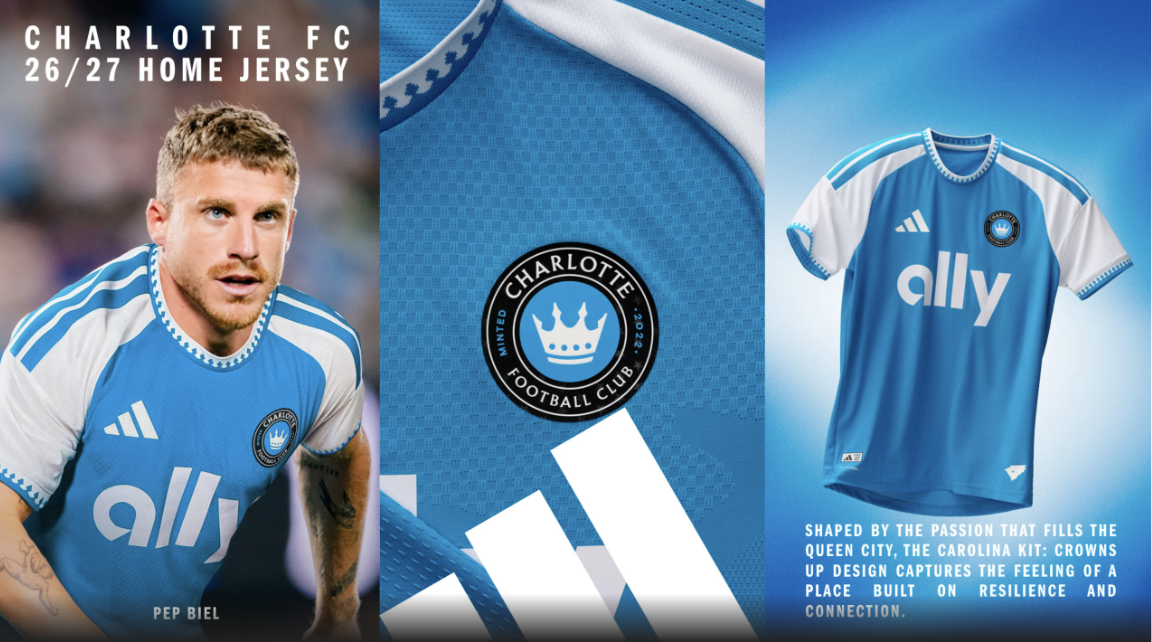
This is really good shirt. It'll look great on the field, and I like the subtle crown touches on the collar. It doesn't take any real swings, but it leans into what this branding does well. It won't look dated within 18 months. Solid play.
12 – Philadelphia Union "1776 Unity Kit"
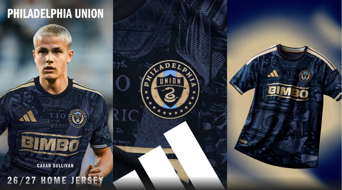
This shirt toes the line between tacky and awesome, and while I'm not sure it fully lands the plane, it's a really fun and bold effort. It isn't shy about leaning into the 1776 theme, and the fact that Philadelphia will host a World Cup Round of 16 match on July 4 makes it even more fitting.
We, the Union 🔔 Honoring the birthplace of our country for its 250th birthday. Introducing The 1776 Kit. #DOOP
— Philadelphia Union (@philadelphiaunion.com) 2026-02-10T16:01:41.132Z
I'll be honest, I've gone back and forth on this. I've had it as low as 19th and as high as 4th. I don't think we can ask for more creativity and risk-taking and then bash the teams that try.
Unless you're St. Louis. Don't be St. Louis.
11 – San Diego FC "Unprecedented Unity Kit"
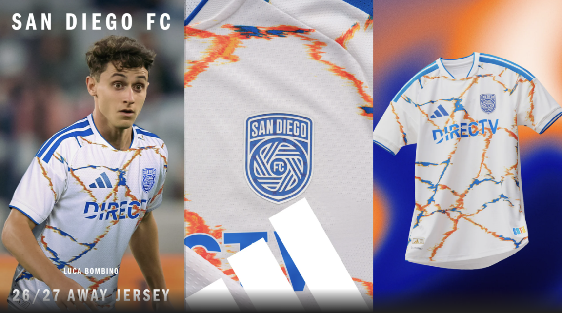
Another kit that you'll either love or hate. I initially hated it, but seeing it paired with blue shorts launched it up the rankings.
Threads filled with energy. Built on unity. ⚡️@adidasFootball pic.twitter.com/4hZskY8ykp
— San Diego FC (@sandiegofc) February 10, 2026
San Diego are going to win lots of games this season while playing some absolutely gorgeous ball. It's fitting that they'll have gorgeous kits to match.
10 – CF Montréal "The Procure Jersey"
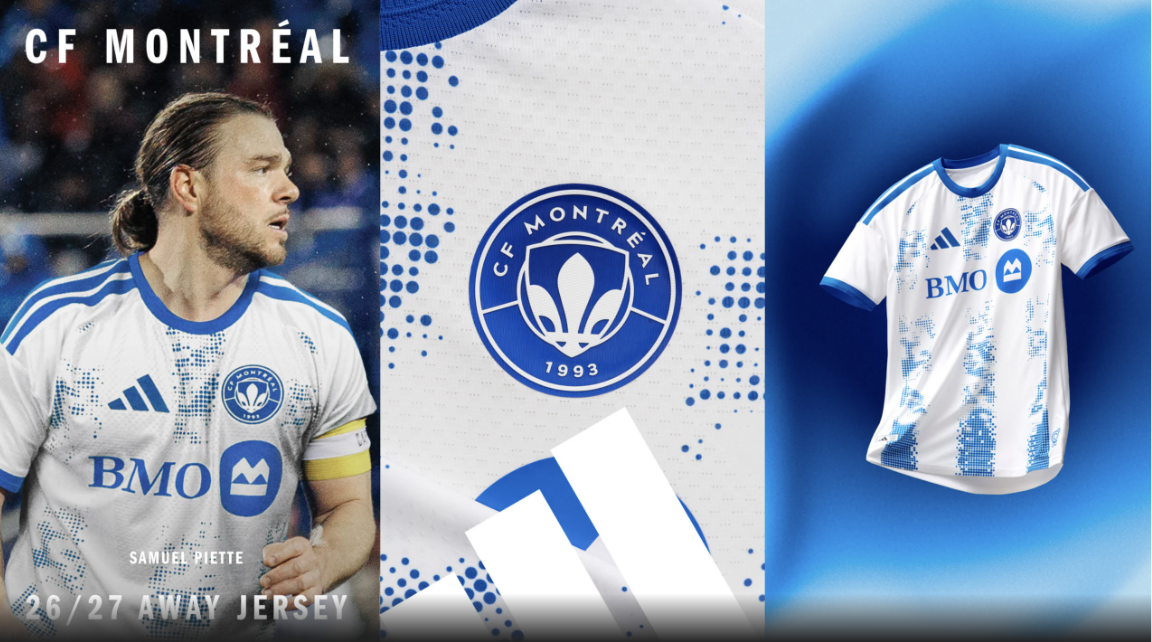
Montréal's play on the pitch seems to have an inverse relationship with the quality of their kits. Unfortunately, this means they're in for a terrible 2026.
This "Procure Jersey" is a nice play off of their home kit, which also features vertical stripes. It's a big win. Something Montréal don't have too often.
9 – Sporting Kansas City "The 18th & Vine Kit"
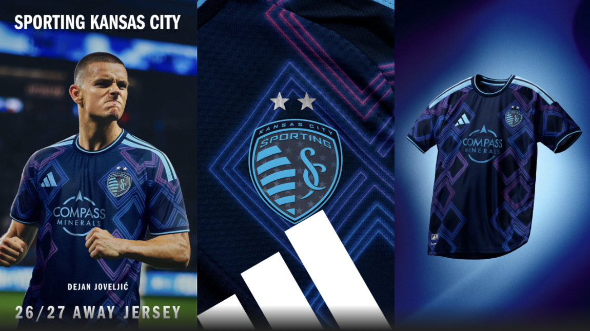
Sporting rarely misses with their kits. This is another great addition to the catalog. The color scheme is fantastic, keeping their distinctive argyle look with a neon twist. Chef's kiss.
This is my 9-year-old son's favorite.
8 – San Jose Earthquakes "The Dead Kit"
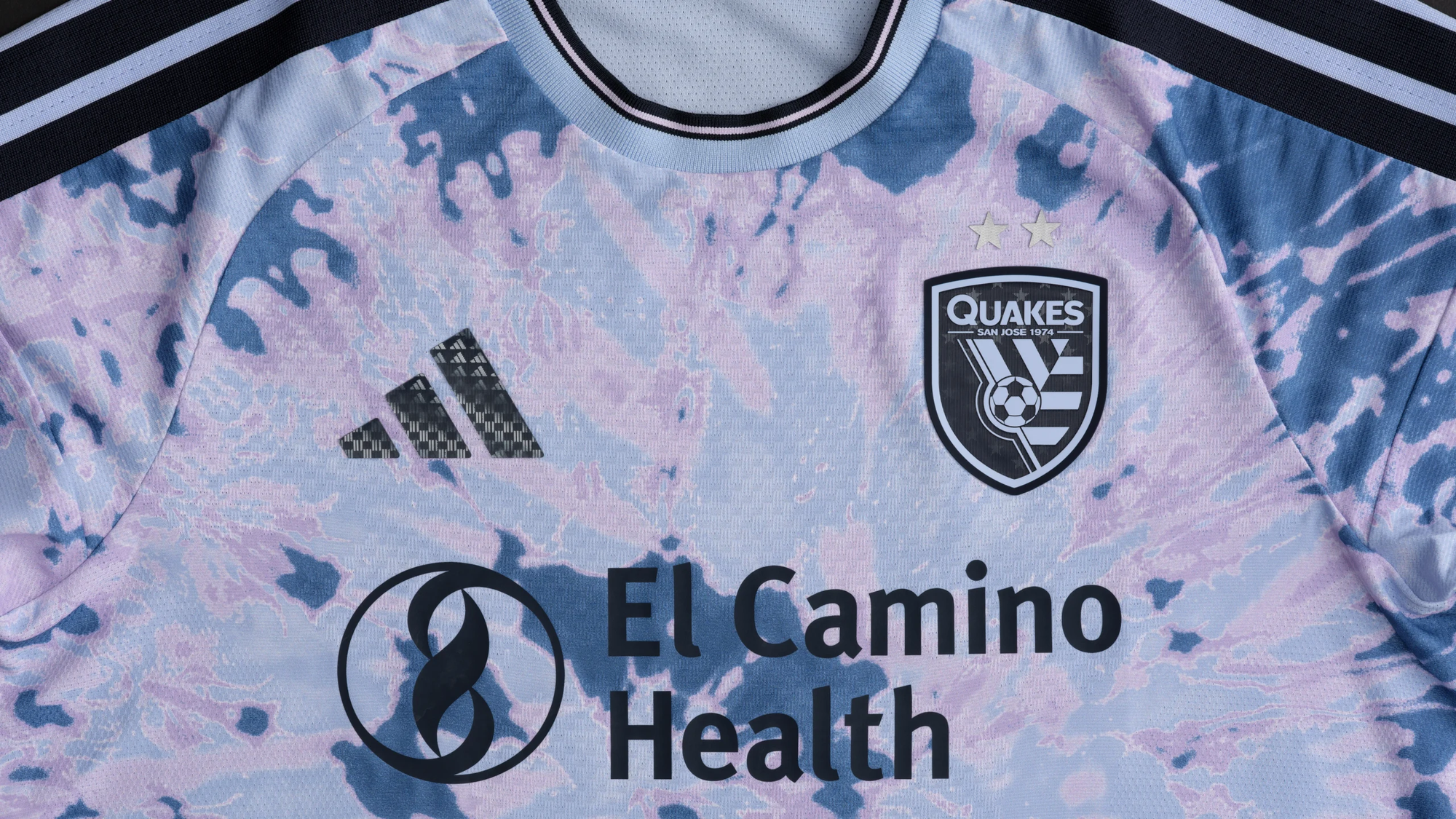
Um... yes.
More than a jersey - it’s a tribute to the Bay. 🎸🗯️🌀
— San Jose Earthquakes (@SJEarthquakes) February 10, 2026
RSVP for the Grateful Dead Jersey Launch.
🔗 https://t.co/r2T0YuABE6 pic.twitter.com/S80Fi89Hk9
(This is my 8-year-old daughter's favorite).
7 – LAFC "Primary Kit"
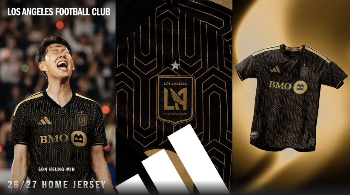
8.5 points for the kit. -100 points for the name.
6 – Minnesota United "The Decade Kit"
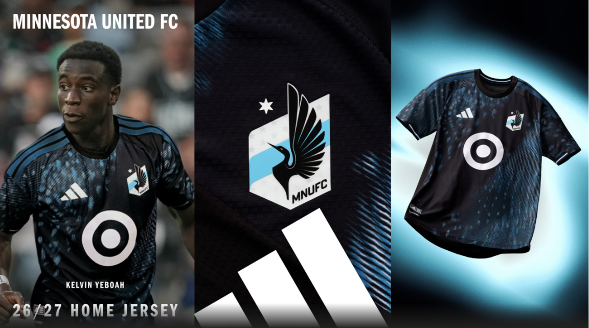
Minnesota just doesn't miss with their kits. They have a distinct visual identity, and their new kit continues that trend.
Past meets present, feat. James Rodríguez
— Minnesota United FC (@mnufc.com) 2026-02-10T15:38:45.120420Z
I would have liked to see bolder colors for some of the detail pieces like the cuffs and shoulder stripes, but it's hard to nitpick too much.
5 – New York City FC "All Nations Kit"
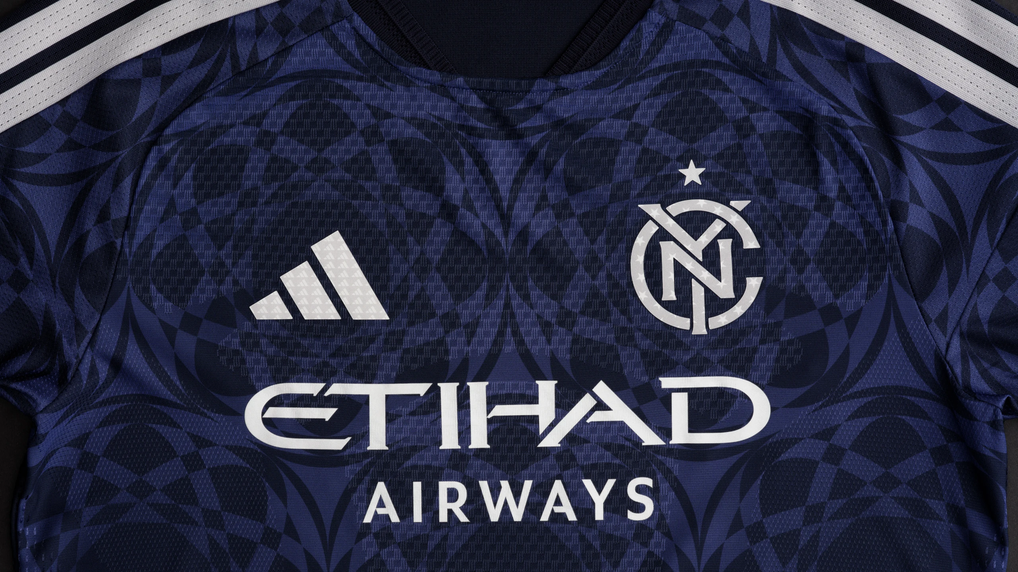
The shirt on its own is fantastic with the geometric pattern, inspired by the Unisphere (a giant stainless steel globe in Queens' Flushing Park). But the full kit...
Reppin' NYC head to toe 🗽 pic.twitter.com/ibQXp5Rm6P
— New York City FC (@newyorkcityfc) February 10, 2026
Absolutely fantastic. This is one of my favorite looks in MLS this season.
4 – Atlanta United "The Spirit of '96 Kit"
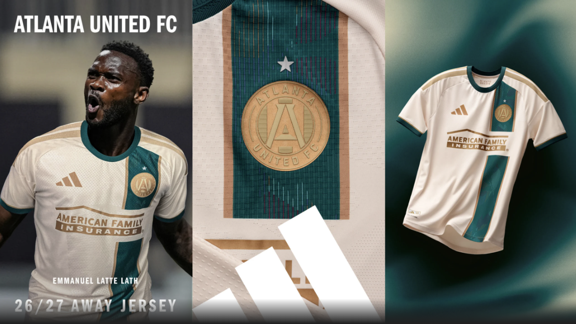
This is a fantastic shirt on so many levels. It veers away from Atlanta's typical color scheme but sticks with a recognizable Atlanta theme. It's unique and tells a story. The Olympic theme and the gold-medal crest are fantastic.
Introducing the Spirit of ’96. pic.twitter.com/UmWHZeRsfu
— Atlanta United FC (@ATLUTD) February 11, 2026
It's going to look sick on the pitch. I'm in love.
3 – Austin FC "Rooted Kit"
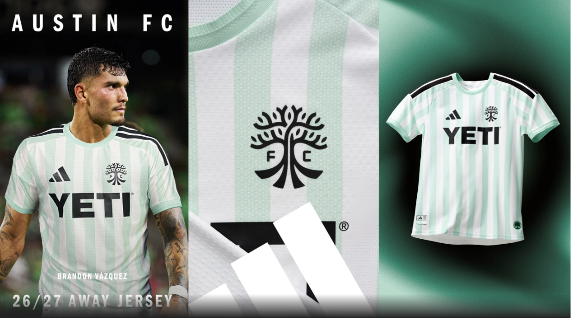
I've really liked the past few shirts Austin have put out, and their newest kit continues the trend of having solid away offerings. Vertical stripes on both kits this season is great.
La raíz de la ciudad.
— Austin FC (@austinfootballclub.bsky.social) 2026-02-11T16:02:43.323Z
I adore the shade of green they're using on this kit, and going with the open crest is a beautiful touch.
2 – FC Dallas "The DNA Kit"
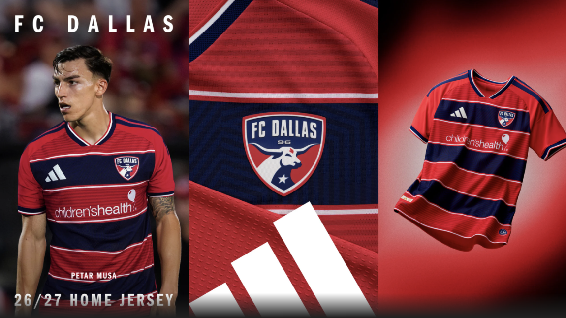
It's impossible to hate hoop stripes that are done well. This is timeless.
Together, we’re connected by our identity, our history, and the shared moments that unite generations.
— FC Dallas (@FCDallas) February 11, 2026
We are connected by our DNA. pic.twitter.com/34ZfcNbF62
I love it.
1 – FC Cincinnati "Seven Hills Kit"
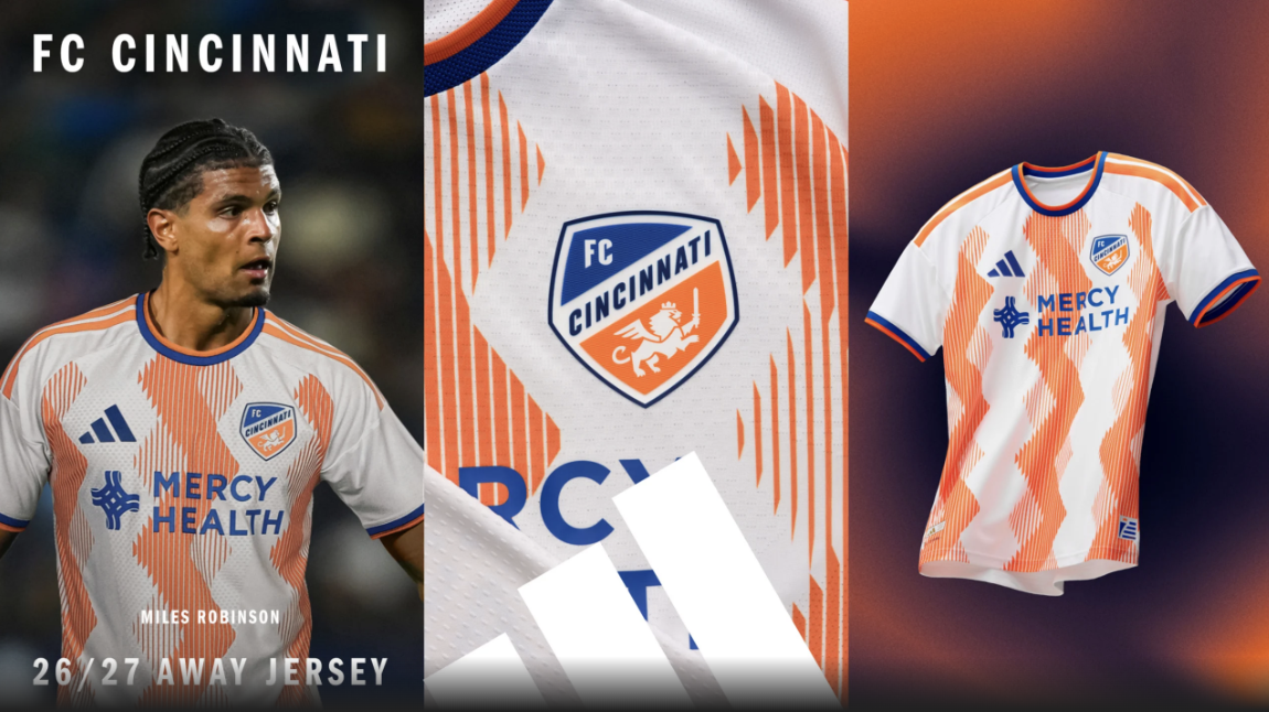
Initially this felt generic, but the more I saw, the more it has grown on me. I like the new take on vertical stripes, and I've never understood why Cincinnati don't lean into the orange part of their visual identity more.
Introducing The Seven Hills Kit. 🔸🔹
— FC Cincinnati (@fccincinnati) February 11, 2026
A symbol of perseverance and resilience - a reminder of triumph over adversity and the strength that unites us.
Order for pickup on FCC Go today: https://t.co/j7coAv5tMt
Stadium Team Store:
February 11–14 | 10 AM – 7 PM
OTR Team Store… pic.twitter.com/T8rSBoRxWq
This kit embraces the orange. The shorts are fantastic. The best look of the year.


